Note
Go to the end to download the full example code.
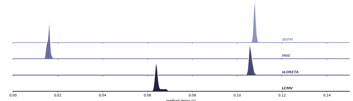
Compare Delays Across Different Source Localization Methods#
This example visually compares the delays observed for several common source localization techniques:
MNE - Minimum Norm Estimate
dSPM - Dynamic Statistical Parametric Mapping
eLORETA - Exact Low-Resolution Electromagnetic Tomography
sLORETA - Standardized Low-Resolution Electromagnetic Tomography
LCMV - Linearly Constrained Minimum Variance beamformer
Now let’s load data and visualize each method’s delay.
Helper function for labeling each row
def label(x, color, label):
    ax = plt.gca()
    ax.text(0.8, .2, label, fontweight="bold", fontstyle='italic', color=color,
            ha="left", va="center", transform=ax.transAxes)
Function to plot KDEs for a list of methods
def plot_method_delays(df, method_names, xlim, ylim, bw_adjust=1, top=0.72):
    """
    Plot KDEs of delays for specified neurofeedback methods.

    Parameters
    ----------
    df : pandas.DataFrame
        Must contain columns 'method' and 'delay'.
    method_names : list of str
        Methods to plot.
    xlim : list of float
        X-axis limits.
    ylim : list of float
        Y-axis limits.
    bw_adjust : float, optional
        Bandwidth adjustment for KDE (default 1).
    top : float, optional
        Top position for FacetGrid (default 0.72).

    Returns
    -------
    g : seaborn.FacetGrid
        FacetGrid object.
    """
    df_sub = df.query("method == @method_names")
    pal = sns.cubehelix_palette(len(method_names), rot=-.05, light=.6)

    g = sns.FacetGrid(
        df_sub, row="method", hue="method", aspect=14, height=1,
        palette=pal, row_order=method_names, xlim=xlim, ylim=ylim
    )

    g.map(sns.kdeplot, "delay", bw_adjust=bw_adjust, clip_on=False, clip=xlim,
            fill=True, alpha=1, linewidth=1.5)
    g.map(sns.kdeplot, "delay", clip_on=False, color="w", clip=xlim,
            lw=2, bw_adjust=bw_adjust)
    g.refline(y=0, linewidth=2, linestyle="-", color=None, clip_on=False)
    g.map(label, "delay")

    g.figure.subplots_adjust(hspace=.15, top=top)
    g.set_titles("")
    g.set(yticks=[], ylabel="", xlabel=r"method delay ($s$)")
    g.despine(bottom=True, left=True)
    return g
Next, visualize delays for “dSPM”, “MNE”, “sLORETA”, “LCMV”
plot_method_delays(
    df,
    ["dSPM", "MNE", "sLORETA", "LCMV"],
    xlim=[0, 0.15],
    ylim=[0, 250]
)
plt.show()
/Users/payamsadeghishabestari/ANT/venv/lib/python3.10/site-packages/seaborn/axisgrid.py:123: UserWarning: Tight layout not applied. tight_layout cannot make Axes height small enough to accommodate all Axes decorations.
  self._figure.tight_layout(*args, **kwargs)
/Users/payamsadeghishabestari/ANT/venv/lib/python3.10/site-packages/seaborn/axisgrid.py:123: UserWarning: Tight layout not applied. tight_layout cannot make Axes height small enough to accommodate all Axes decorations.
  self._figure.tight_layout(*args, **kwargs)
/Users/payamsadeghishabestari/ANT/venv/lib/python3.10/site-packages/seaborn/axisgrid.py:123: UserWarning: Tight layout not applied. tight_layout cannot make Axes height small enough to accommodate all Axes decorations.
  self._figure.tight_layout(*args, **kwargs)
/Users/payamsadeghishabestari/ANT/venv/lib/python3.10/site-packages/seaborn/axisgrid.py:123: UserWarning: Tight layout not applied. tight_layout cannot make Axes height small enough to accommodate all Axes decorations.
  self._figure.tight_layout(*args, **kwargs)
Next, visualize delays for “eLORETA”
plot_method_delays(
    df,
    ["eLORETA"],
    xlim=[0.7, 1.1],
    ylim=[0, 40]
)
plt.show()

Total running time of the script: (0 minutes 0.556 seconds)